What Makes an App Feel Premium (and Trustworthy)
People decide whether to trust your app in seconds, and they could not tell you why. The answer is not expensive visuals. It is accumulated care, and you can learn to see it.
A stranger opens your app for the first time. Within a few seconds they have formed a verdict, and they could not tell you how. The screen either feels right or it feels off. When it feels off, the verdict takes a very practical shape: I am not entering my card into this.
Nobody announces that an app feels cheap. They just leave, and you never find out why your signups keep stalling at the payment step.
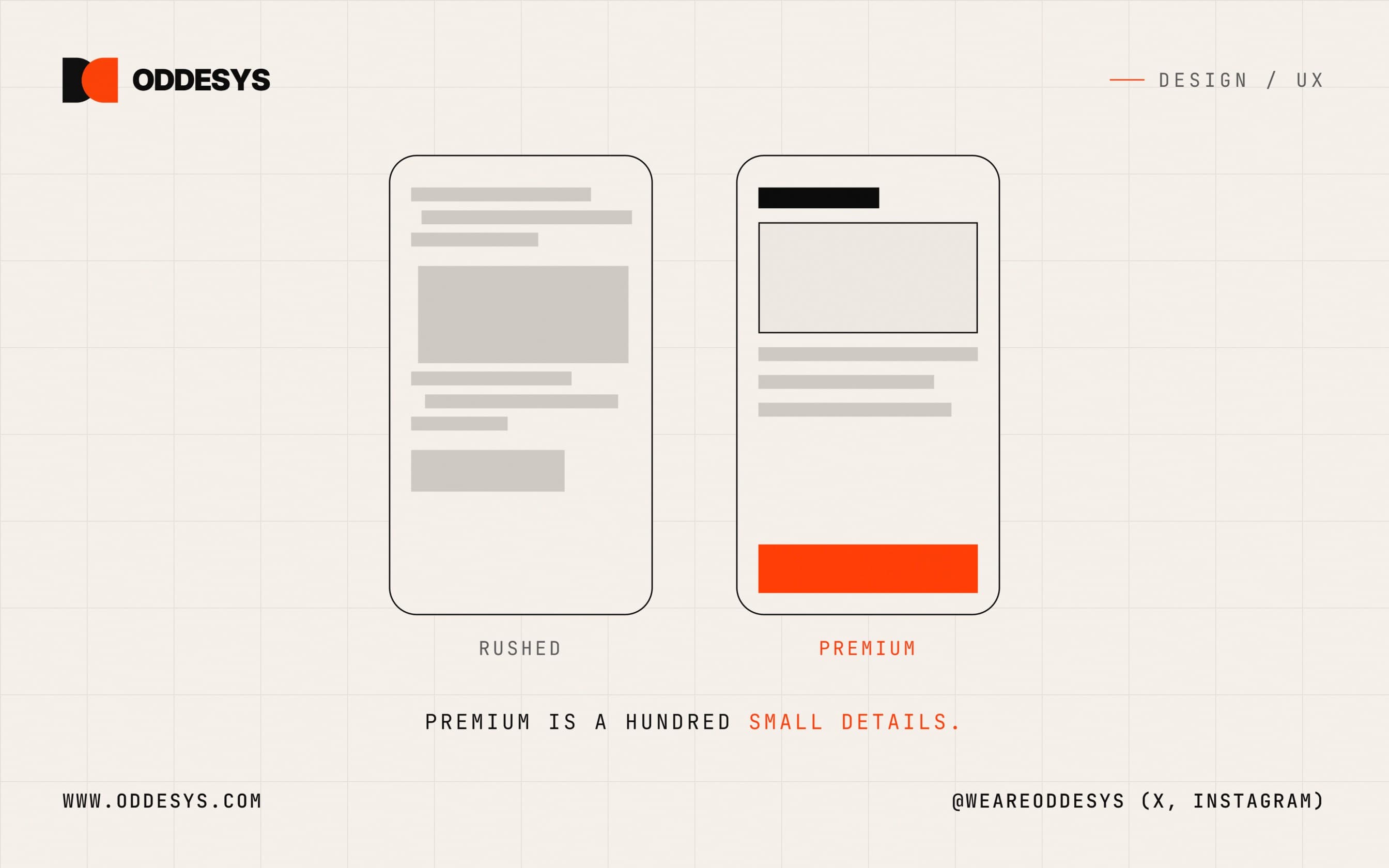
Premium is not a visual style. It is not gradients, glass effects, or an expensive logo. It is accumulated care: dozens of small decisions that each cost someone an extra hour, stacked until the whole product feels solid. Care is also learnable, which is the point of this post. Here is where to look for it.
An app that answers when you touch it
Tap a button in a great app and something happens in the same instant. The button darkens, the screen starts to move, some small acknowledgment lands before the real work is done. The app heard you. Tap a button in a cheap app and there is a pause where nothing changes. You wonder if your tap registered, and a small doubt opens that never quite closes for the rest of the session.
That instant between your finger and the response is where confidence lives or dies. An interface that acknowledges every touch feels like it knows what it is doing. One that hesitates feels like it might drop whatever you hand it, including your payment.
Here is the encouraging part: this does not require a fast backend. It requires an interface that responds while the backend works. A button can change state instantly even if the request behind it takes three seconds. Acknowledgment is a design decision, not a performance budget. Your customers will never describe any of this in words. They will call one app smooth and the other one janky, and they will type their card number into the smooth one.
Space, order, and one set of hands
The next layer of care is structural, and it comes down to four habits.
Space. Crowding reads as cheap. When every element fights for room, the screen looks desperate, and desperation is the opposite of premium. Generous space says the maker was confident enough to leave room, and alignment is the skeleton underneath it: when edges line up from screen to screen, on a real grid, the product reads as intention instead of accident.
Consistency. A premium app feels like one coherent product. A cheap one feels like five screens built by five people who never met. Rounded buttons here, square ones there. Sign in on this screen, Log in on that one. Each seam is tiny on its own. Together they suggest that nobody was in charge.
Hierarchy. On a screen built with care, your eye always knows where to go first. One thing is biggest, one action is brightest, everything else steps back and waits. When everything shouts at the same volume, the reader has to do the sorting the designer skipped, and they can feel themselves doing that work even if they cannot name it.
Motion. Animation belongs when it explains something. A panel that slides in from the right tells you where you are and which way is back. A card that grows out of the thing you tapped tells you what it belongs to. Motion that only decorates, bouncing icons and slow fades on every transition, does the opposite of its job. Keep it fast enough that nobody ever waits for it twice.
The three state test
Here is the most useful trick we know for judging the care inside any app, including your own. Ignore the home screen. Everyone polishes the home screen. Go looking instead for the three screens nobody puts in the marketing.
First, the empty one. A brand new account with nothing in it is the very first thing every user sees, and cheap apps treat it as an afterthought: a white void with the word Empty floating in gray. An app built with care treats that blankness as a welcome. It shows you what will live here, and it hands you the first step.
Second, the loading one. Loading is a promise that something is coming, and a spinner with no end is a promise with no terms. We have all sat watching one, unsure whether the app is working or has simply died. A sketch of the incoming layout, a line about what is happening, any signal that someone expected you to wait here makes the same delay feel completely different.
Third, the broken one. Errors are the deepest tell, because error screens get built when the team is tired and the deadline is close. A form that throws away everything you typed because one field was wrong. A message that says Error 422: Unprocessable Entity to a person who only wanted to book an appointment. A payment that seems to go through but never confirms, leaving the customer staring at the screen with no idea whether their money went anywhere. None of these are rare. All of them are decisions someone made by not deciding.
Empty, loading, broken. Open any app you admire and find those three screens. That is where the care is, or is not.
Words run through all three states, and words are the easiest part of feel to fix. Someone either wrote each message for a human being or let the system speak in codes. "We could not process that card. Please check the number and try once more." A sentence like that takes a minute to write, and it is the difference between a customer who retries and a customer who is gone.
Why care pays
It is fair to ask whether customers really notice any of this. They notice without noticing, which is exactly why it matters. Entering a card, an address, a phone number is a moment of small vulnerability, and people go through it only for software that feels like it deserves the information. The same product at the same price converts better when it feels solid, because trust sits underneath every conversion number you track.
Premium feel also carries premium pricing. People pay more for things made with evident care, in software just as in furniture or coffee. If your app feels like a template with your logo on it, you compete on price forever. If it feels considered, the consideration is part of what you are selling.
And care brings people back. Nobody recommends an app by praising its empty states. They say it just works, which is the highest compliment software ever receives and the vaguest, and underneath it sits everything in this post.
So run the test tonight. Open your own product, find the empty screen, the loading screen, and the broken screen, and read them as if you had never seen them before. If you do not love what they say about you, or you want an outside read on how your app feels and not just whether it functions, you can find us at oddesys.com.